| |
|
 |
| |
|
An arbitrary and blasphemous use of
a Sacred Image
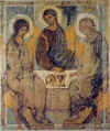
This image seems blasphemous to us or at least it shows that, while the Church
of Christ is based on the Holy Trinity, Kiko’s conception of the Trinity is a
human construction based on three distinct, not equal, persons. We cannot help
highlighting the excess of liberty—which turns into desecration—in Kiko’s
defacing the stupendous artwork of Rublëv, substituting the three Angels
representing the three divine Persons with the images of the three leaders of
the NCW, ignoring and erasing even the rest of the wonderful symbolism of
Rublëv’s painting. [Click here to see the full image and its details]
It dates back to many years ago. Regarding the faces of those who, in Rublëv’s
Trinity, were three Angels, it’s easy to recognize different features: The
bearded man on the right is identical to D. Mario Pezzi; at the center we see
Kiko’s face, that we find also in other Neocatechumenal icons of Christ; on the
left, there’s a woman’s face: What else could it be if not the younger and
idealized version of Carmen, at the times of the painting?
The condemned similitudes denote at least a bad taste, but what let us upset and
perplexed is the writing above, written by the author of the icon, that states:
“Dios es = Comunidad, Liturgía, Palabra,” that is: “God is = Community, Liturgy,
Word.” This statement is unmistakably blasphemous, because it reduces the
Trinity (the cardinal dogma of our Creed and Source of our deepest identity as
Christians and human beings) to the so-called ‘tripod’ on which the NCW is
founded (precisely: Community, liturgy, word). The writing is blasphemous in se,
because trivializes and disfigures the greatness and the mystery of the dogma of
the Three Persons united and distinct, turning them into the three moments of
the NCW, between which the concept of community stands out: Is that an allusion—meminisse
horret—to the fact that where there’s not a community (a Neocatechumenal
community, of course), even the Trinity is missing?
Community – Liturgy – Word are three steps that can be found also in the Church,
but in this case they are exclusively applied to the Way. Ergo, the equations
‘God = Community’ brings as a consequence the other one ‘God = the Way’. It
would be incorrect to affirm such a thing even about the Church, since God IS
NOT the Church, but He manifests Himself and is present in it, and He guides it.
It’s not acceptable that a Supernatural Entity is mistaken for realities that
belong to the natural order.
Even the most ingenuous people may realize how this subliminal message passed
through the icon is misleading: How is it possible that the Holy Trinity (the
three Divine Persons: The Father, the Son, and the Holy Spirit) is (willingly)
confounded with the three canons of a human praxis? Let alone the three leaders
of the Way represented in the sacred image…
Furthermore, in this way the sacred is trivialized. We must instead restore the
sense of the Worship of these images, which are like windows on the Mystery,
also because they’re painted according to canons that are well defined, after
praying and fasting: Above all; they are the fruits of Contemplation, not of an
interested whim or a more or less inspired phantasy.
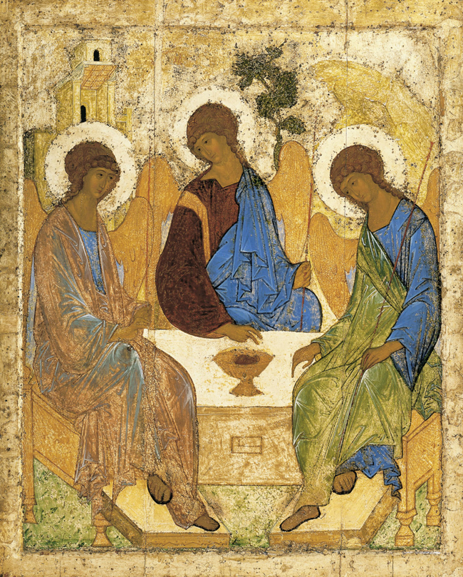
Let’s ignore for a moment Kiko’s image and look at Rublëv’s original painting.
We took a version in big format and with good colors from one of the many sites
which host it.
http://www.piccolemissionarie.org/wp-content/uploads/2009/06/trinita-di-rublev.jpg
The right interpretation of the ancient icon is the Father on the Left, the Son
at the center and the Holy Spirit on the right. Nobody ever wrote that the
painting must be interpreted like that: It’s the tradition based on some
trustworthy element which makes us see the picture this way: The Son and the
Holy Spirit proceed from the Father; we also notice that the right and center
figure bend their heads toward the one on the left. On the other hand, the
Father contrasts and accompanies the movement of the Son and the Holy Spirit
with His blessing hand and His bending head that express authority and sweetness
at the same time.
If we focus on the gestures, we are linked to the love relation of the divine
Hypostases which create a circular movement spreading from the Father and coming
back to Him through the Son and the Holy Spirit.
The right hand of the Father blesses the Son, who, in turn, blesses the Holy
Spirit. The latter delicately lays His hand on the altar pointing at two things:
The sacrifice of the immolated calf whose head can be seen in the cup at the
center (the very same form of the altar—defined by the two external figures, the
mantel and the frontal—is a cup which may be identified as the Sacred Chalice),
and a recess below, on the frontal, which reminds of the parable of the narrow
door.
The colors are typical, too: Blue for the divinity and the ineffability of God
(blue is the color of the sky). Then, the Father is dressed in rose, that’s the
sum of regality, red + light, white; the Son is dressed in blue and purple red,
which are the colors of His belonging both to the Heaven and to the earthly
regality (they’re the traditional colors that we can see in every image of
Christ); the Holy Spirit is dressed in green, which is the liturgical color of
the holidays in His honor.
The last things we may observe are the house above the Father (which reminds us
of the house in the parable of the prodigal son); the tree; the wood of the
Cross, above the Son; and the rock, below the Holy Spirit (there are several
biblical references).
Sadly, we have to return to Kiko’s painting. We can formulate two hypotheses:
Either he took only the icon of the Trinity as an external model, fancied that
it could represent the Way, eliminated the symbology of the gestures, the colors,
the elements that place the icon in a scriptural context (except for the tree)
and created an icon of the Way—exclusively of the Way—with the faces of its
founders who are sitting at the table—a sort of ‘Neocatechumenal First Communion”;
or this is an authentic plagiarism presenting the Trinity as something limited
and framed into the founders’ vision.
The fact is that, in the icons, even if we can identify the subject by the
external appearance, it’s the title which determines it. Here, we don’t read “Trinity”:
That can engender a lot of confusion…
However, we know very well that the intentional ambiguity misleads and instills
in the mind of the simple one the new Neocatechumenal dogmas. In our opinion,
this facts speak for themselves and should be vigorously condemned instead of
being tacitly accepted by us common Christians while are worshipped by the
so-called ‘First Division Christians’ who belong to the NCW.
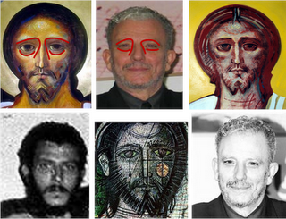
We point out that the details of Kiko’s face in his icons have been reported not
only by us but—independently from us—also by Francesco Colafemmina, who writes
about the icons to the side in his blog Fides et forma: “By observing many icons
or frescos by Kiko Argüello it’s impossible not to notice the detachment from
the classical style of the Russian icons by which he says to be inspired. In
particular, the curve of the superciliary arch, the deformation of the face (not
oblong as in the “Arabian” style of the classical byzantine icons), and the
cheeks that are not rounded but almost emaciated and covered by an uncommon,
thin beard cannot but reminds us of the somatic traits of the very same Argüello
who isn’t then diffident about ‘artistically’ identify his image with that of
Christ.”
The most inconceivable thing is that nobody in the Church has ever found fault
with anything, in spite of the repeated complaints…
|
|
| |
 | |